Crunchyroll Concept
A fresh look at the anime streaming app!
A new look at the crunchyroll streaming platform that puts the user experience first in every way, with innovative new ui that’s packaged in a way that's modern, clean, and minimalist.
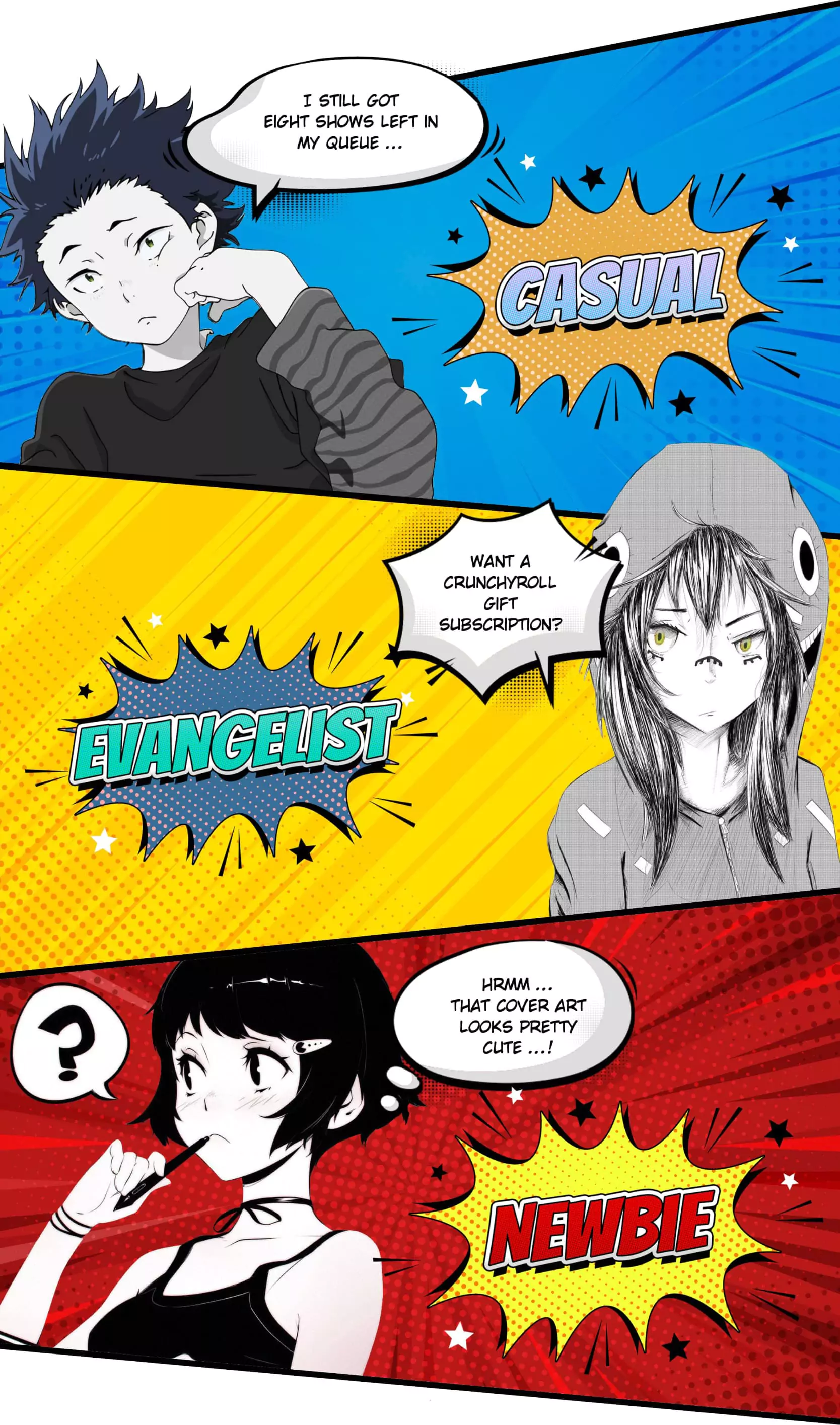
Archetypes
Although user personas can be great, we think archetypes are even better. Each of these user archetypes has their own set of behaviors and goals, as well as objectives and metrics crunchyroll wants to achieve for each archetype.
Objectives
Create a streaming concept that can cater to all archetypes of users on one platform. Therefore, it must introduce shows to those new to anime, those who casually keep to their favorite shows, to power users who meticulously track their next episodes.
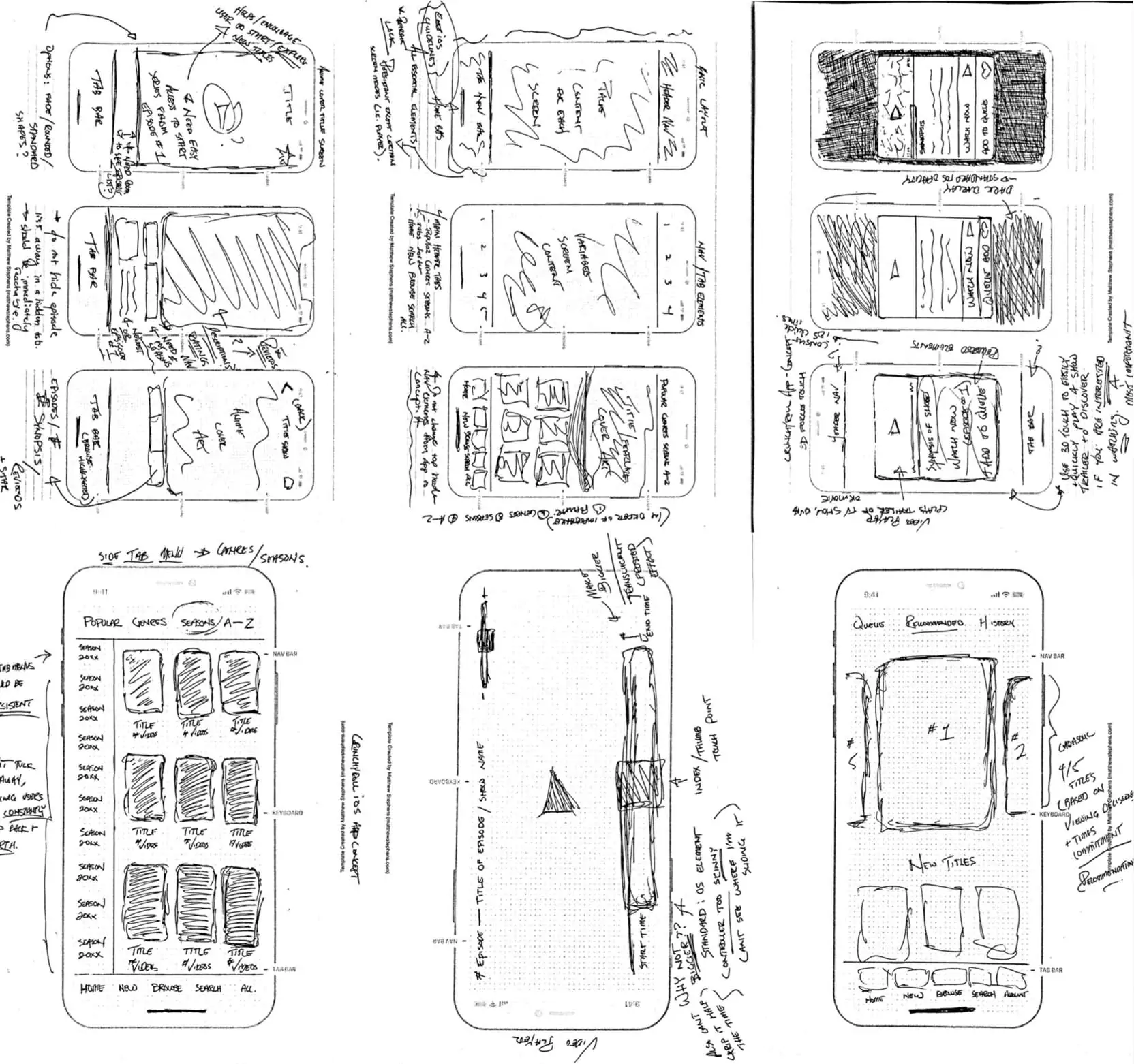
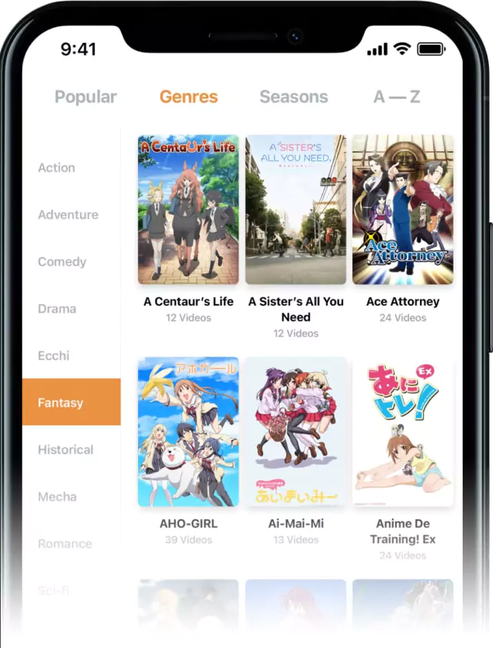
Wireframes
Abstract, conceptual sketching via pen and paper. The main objective wasn't to re-invent the wheel, but to look for opportunities where it could be improved wherever we could.
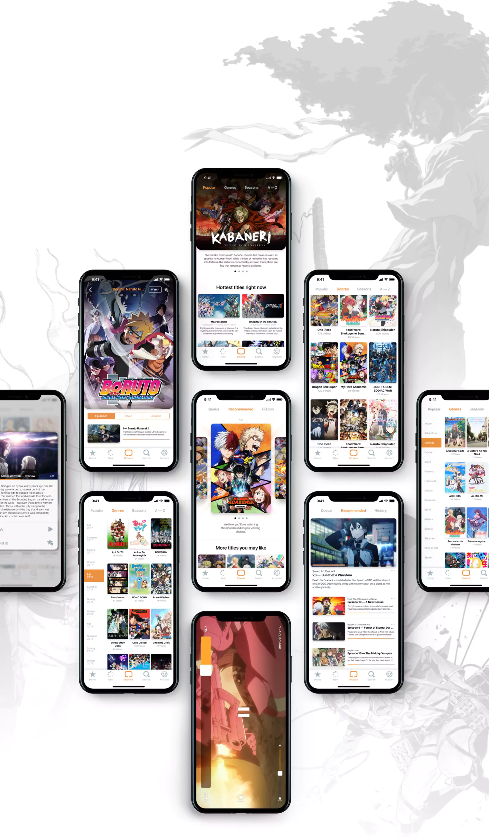
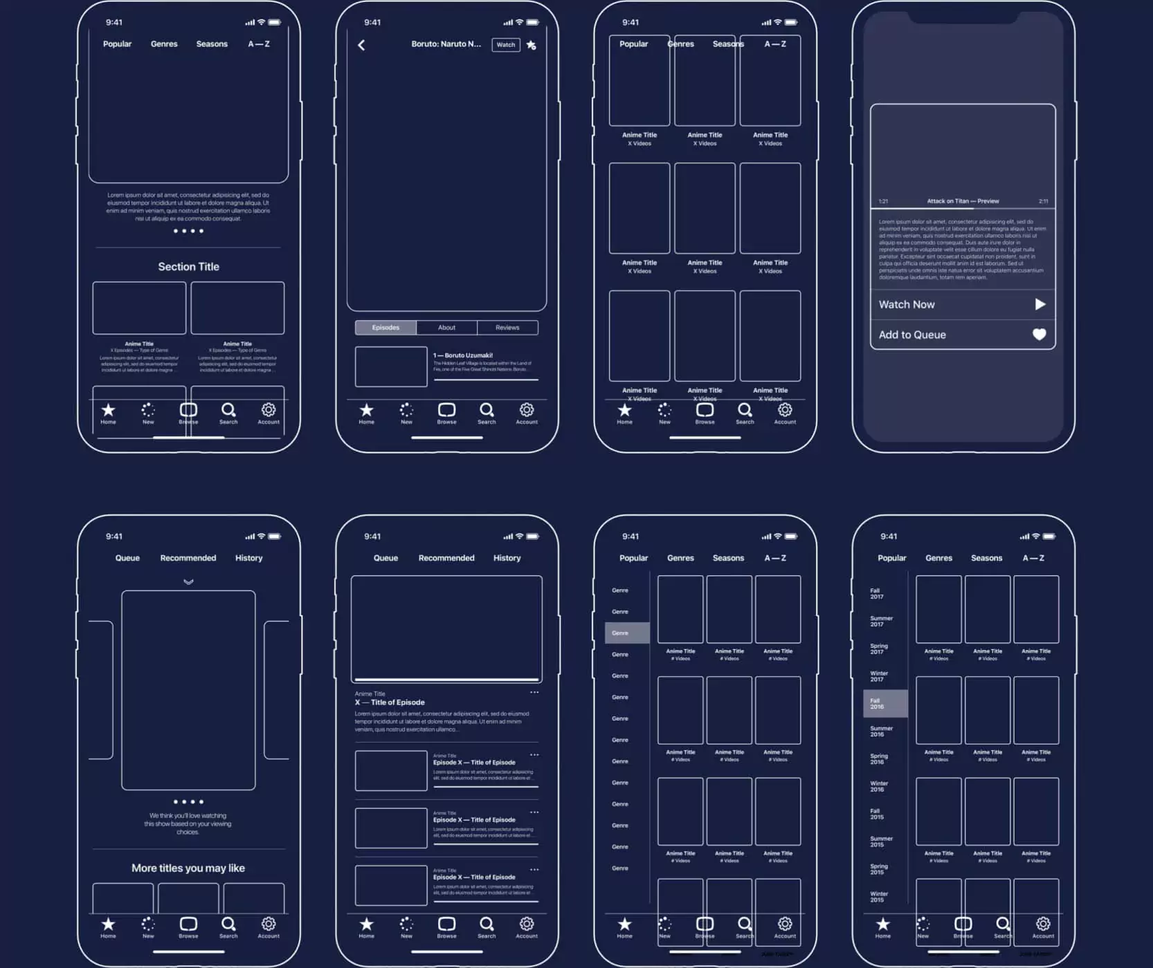
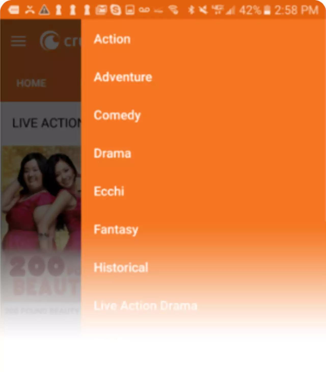
Modular Wireframes
Initial sketches fully realized and completed into modular UI elements and components. Ready to be adapted to content as need to be presented to users.
Comfortable Video Player
A larger, wider video player slider leads to a much more comfortable experience for all users with basically zero downsides. An upgrade in every way.
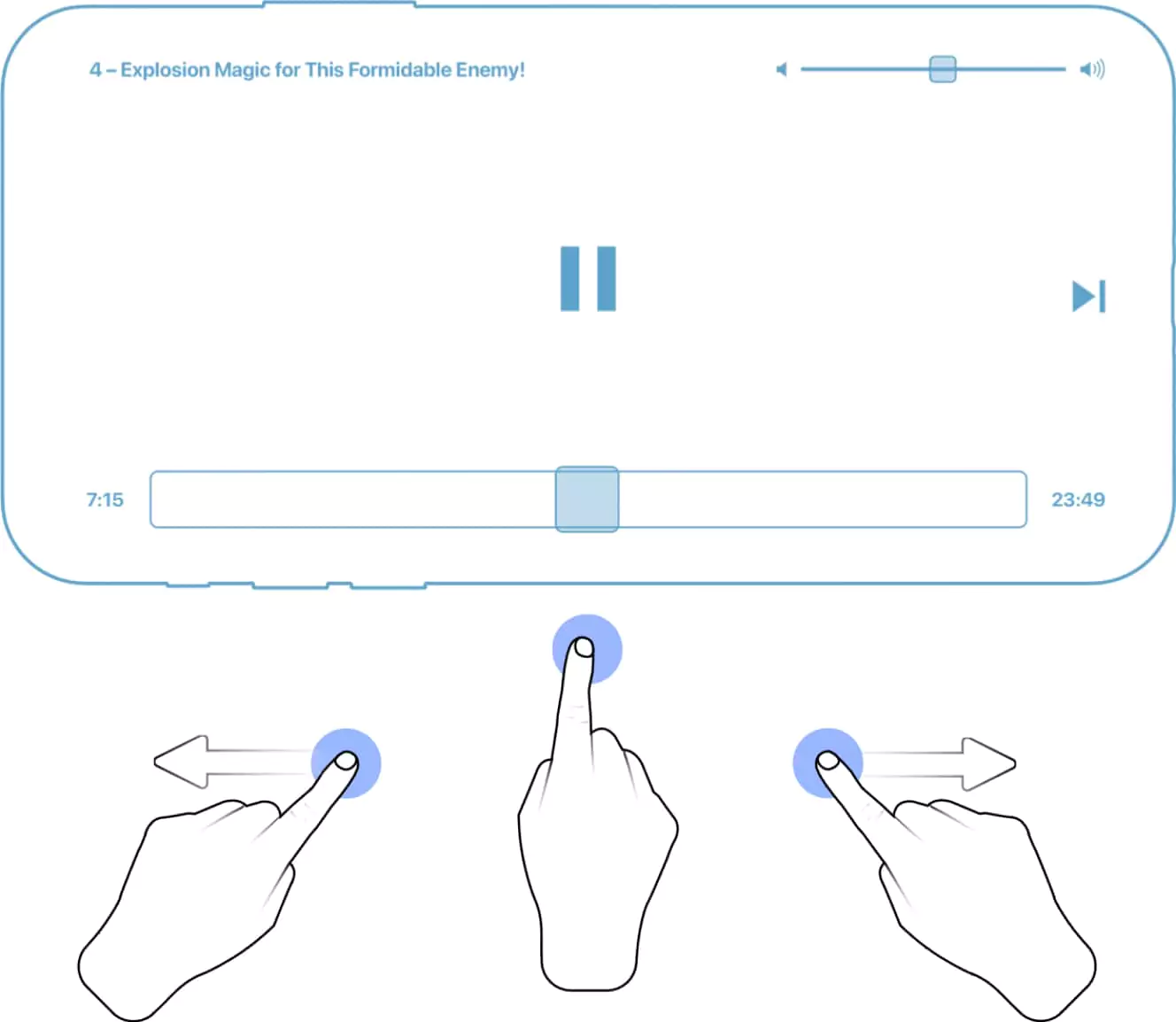
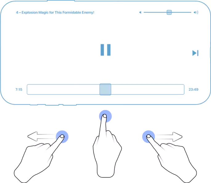
A larger slider knob to see where you are going to. the either thumb in a perfect 50/50 comfort of being able to use split direction.
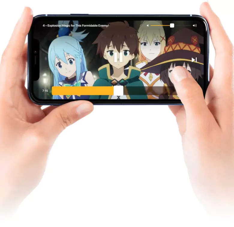
Ever been annoyed at those skinny video slider bars with small knobs that you can't see when you try to use it? We don't think it has to be that way at all!
Our translucent bar is unobtrusive, patterned with cross-hatching to give it a feeling of texture, and a larger knob that feels so comfortable and precise to use.
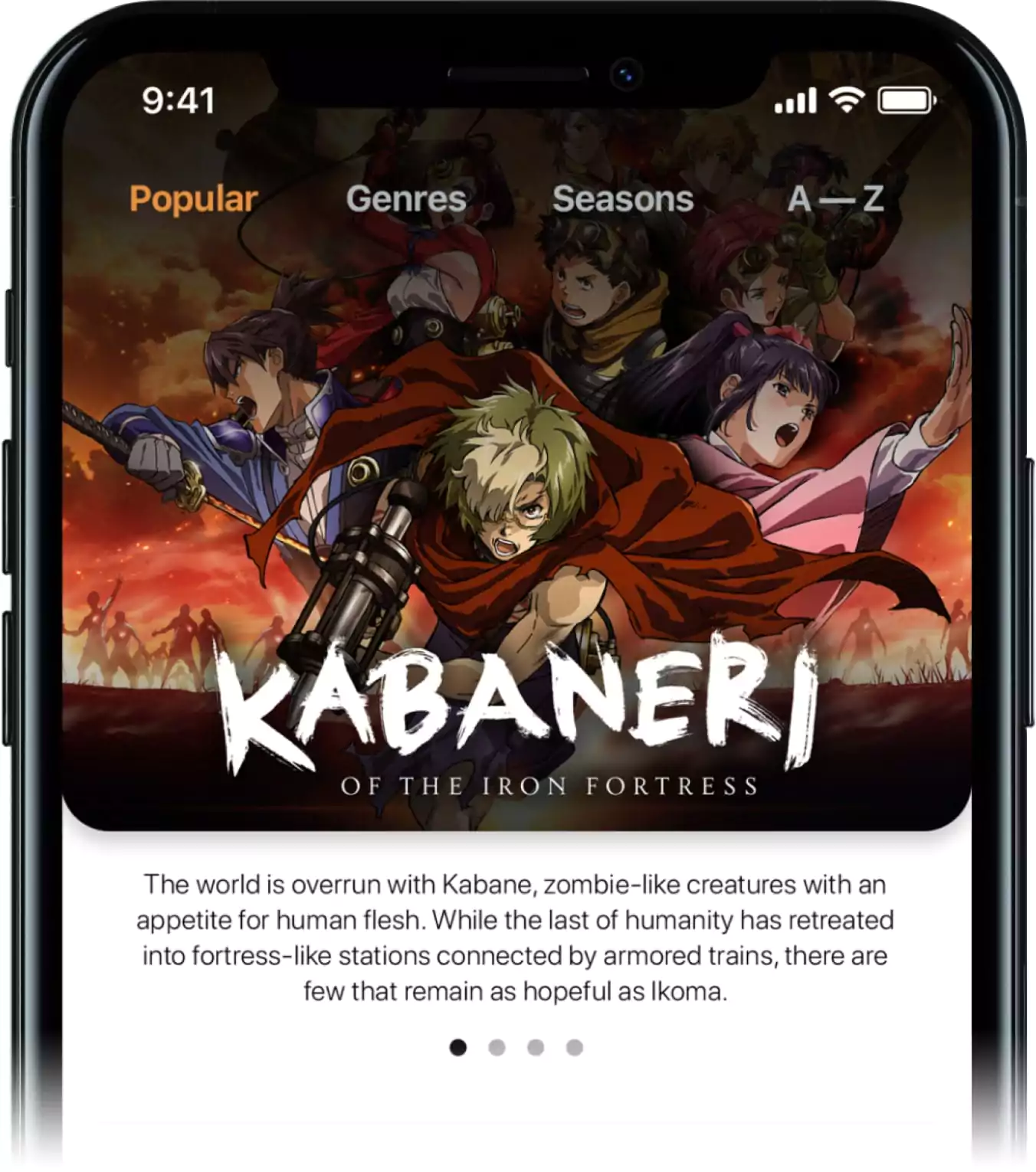
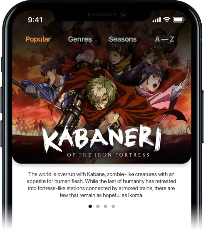
Friendly to anime newbies
The strength of Anime cover art is that it can be so abstract, conceptual, and expressive. But it can also be difficult to get a sense of what the title is about. Adding a concise summary underneath can be very helpful.
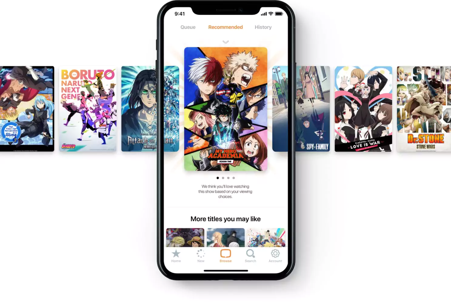
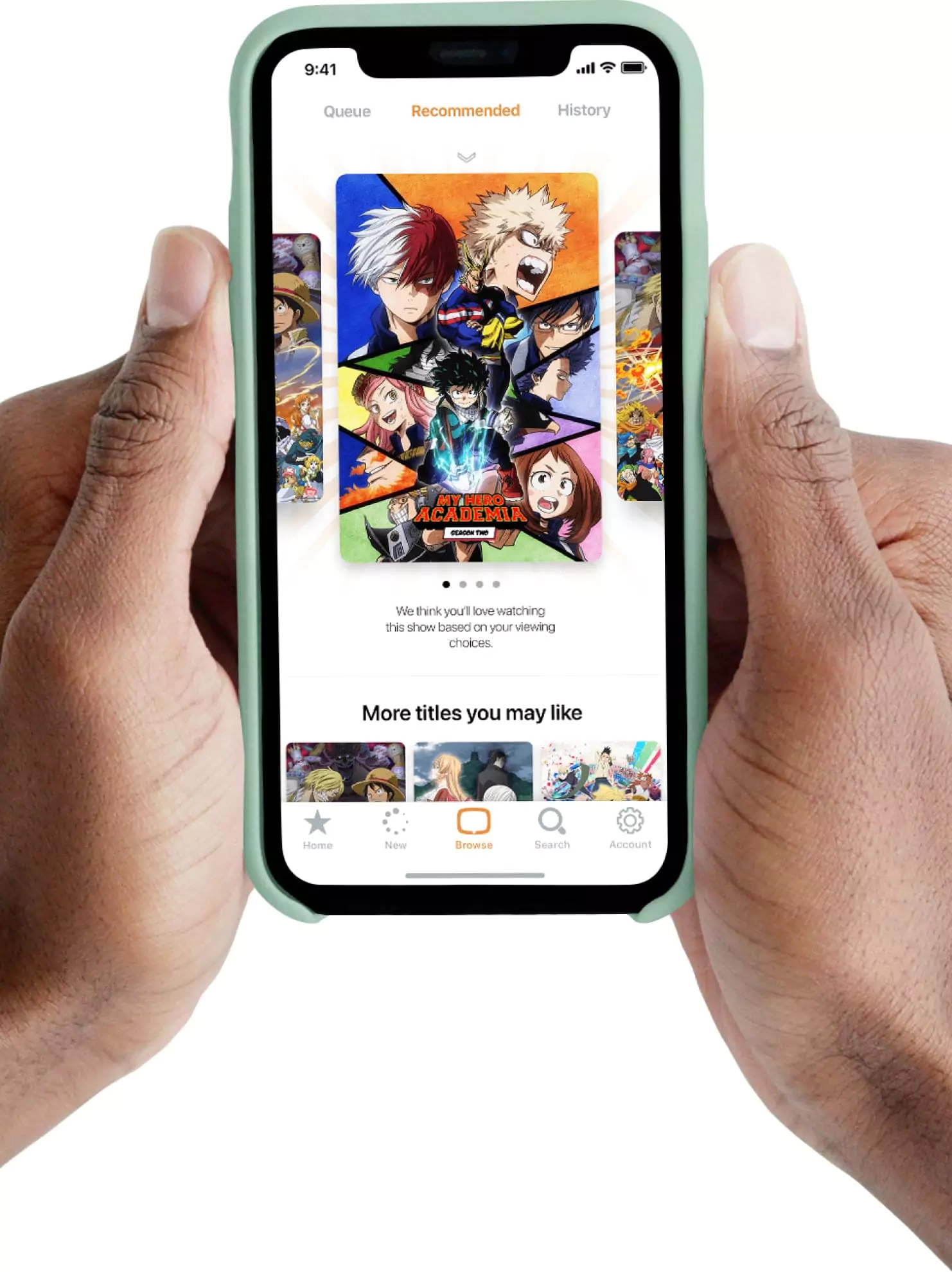
Less is more (meaningful)
Recommending titles based on viewing patterns can help users discover new shows of a similiar type, and extend legs for older titles in the catalog.
Conclusion
Sometimes the best UI are the ones you never notice. We wanted the UI elements to fade seamlessly into the background, allowing the vibrant anime art to shine.